Yes the pictures match the description. My favorite picture is of the orange sparkles, I like how the orange sparkles fill my hair. My least favorite picture is of the bed spread only because it extends throughout the whole picture. Overall great double exposure!
I like your mini concentration. Your idea was really good but i feel like you could have done a little more photo shop so that you couldn't see the background picture, but overall the pictures did turn out really well and i liked them. My favorite one was the first one at the top, i liked the color and the way that the picture is set up, looks really good!
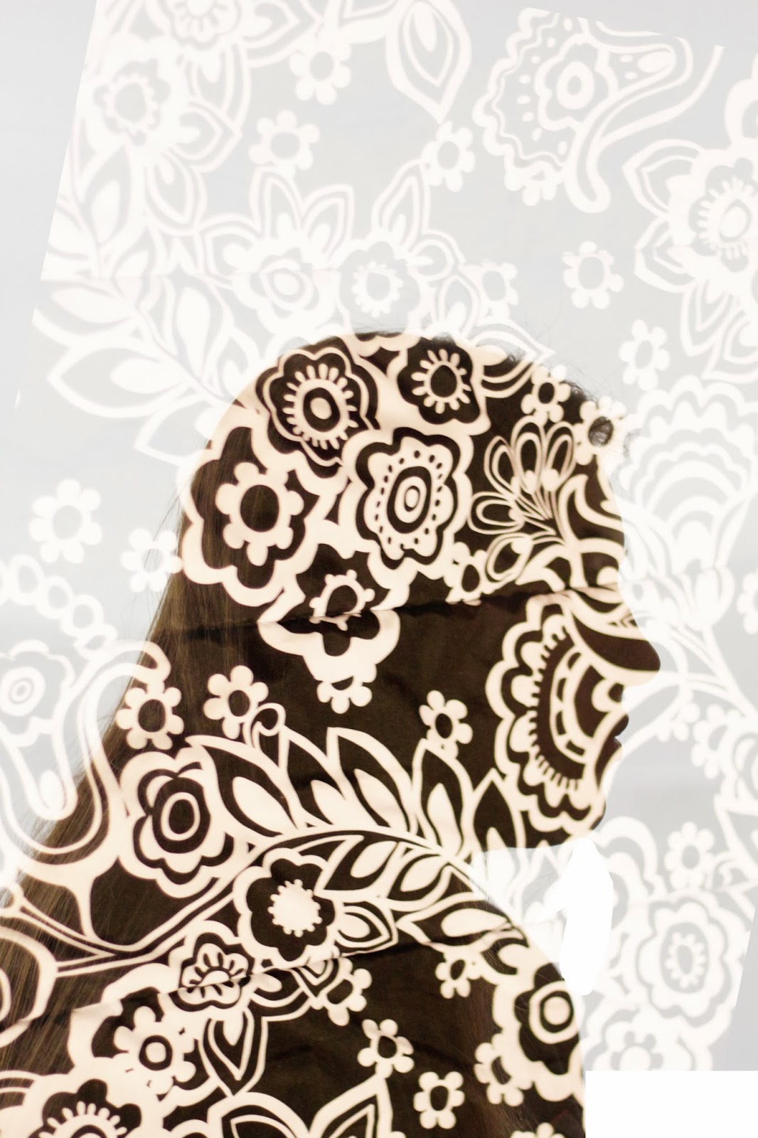
Your description is good and your photos are so beautiful! I felt you executed this really well and the idea and photos are A++. My least favorite is the 3rd picture (where you can see the stripes and the face) because I don't like the face in the photo- I feel the "cut-out" look fits your theme better. My fav is the first because I love the "cut-out" and it really sets the tone for the whole set. Good job :)
- I love your mini concentration it is something I love to do all the time in my photos, I love the images that are on top of the portraits that make it a double exposure. Over all the photos are awesome.
I like the first two photos a lot, especially the first one. The third one doesn't quite work for me and on my computer(with a good screen) the double exposures on the 4th & 5th have a lot of extra image in the white space...but our screens at school do not show whites well. Overall good work, but nothing that I haven't seen before...take some risks. 45/50


Yes the pictures match the description. My favorite picture is of the orange sparkles, I like how the orange sparkles fill my hair. My least favorite picture is of the bed spread only because it extends throughout the whole picture. Overall great double exposure!
ReplyDeleteI like your mini concentration. Your idea was really good but i feel like you could have done a little more photo shop so that you couldn't see the background picture, but overall the pictures did turn out really well and i liked them. My favorite one was the first one at the top, i liked the color and the way that the picture is set up, looks really good!
ReplyDeleteYour description is good and your photos are so beautiful! I felt you executed this really well and the idea and photos are A++. My least favorite is the 3rd picture (where you can see the stripes and the face) because I don't like the face in the photo- I feel the "cut-out" look fits your theme better. My fav is the first because I love the "cut-out" and it really sets the tone for the whole set. Good job :)
ReplyDelete- I love your mini concentration it is something I love to do all the time in my photos, I love the images that are on top of the portraits that make it a double exposure. Over all the photos are awesome.
ReplyDeleteI like the first two photos a lot, especially the first one. The third one doesn't quite work for me and on my computer(with a good screen) the double exposures on the 4th & 5th have a lot of extra image in the white space...but our screens at school do not show whites well. Overall good work, but nothing that I haven't seen before...take some risks. 45/50
ReplyDelete